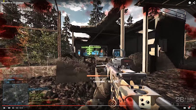
Modern day game interfaces are getting ridiculous. I can think of at least three EA games that have this HUD clutter problem. Battlefield 4 when it first launched was insane.
Shift 2 also has the same problem. There is an option to disable the HUD, but that leaves out some of the information I care about. I am not sure why the developers won't give us the option to disable, resize and move UI elements.
I think simple tweaks to the UI can greatly impact the experience.
 |
| Battlefield 4 UI at launch. Insane HUD clutter |
 |
| Need For Speed Shift 2 HUD |
No comments:
Post a Comment